
As you may have noticed, this year I’ve been focusing a bit more on bigger sets. Not just because they’re large and keep me busy while building, but also because they’re genuinely interesting and/ or good. The Downtown Flower and Design Stores (41732) were a good start and the Heartlake City Community Center (41748) and Heartlake City Community Kitchen (41747) are following in its footsteps – or so you may think. Let’s see where the truth lies.


Price and Contents
While there’s a reason I’ve lumped the two packages together for one article, they must be purchased individually. As you can imagine, this makes the whole venture a potentially costly one right off the bat because even the combined accrued discounts for both sets can never compete with a potential super sale of a single package. The Heartlake Community Center (41748) therefore can set you back 150 Euro for 1513 pieces if you buy it for the recommended full price. Thankfully the set is on permanent discounts, so you can get it for around 110 Euro easily. I took my chances when it was even cheaper and got it for 98 Euro. That’s still quite a bit, but at least affordable if you scrape together enough pennies, in a manner of speaking. At the very least it fulfills all requirements/ established standards with that price per piece thing and you’re really getting a large building out of it.

The Heartlake Community Kitchen (41747) is a slightly different story. At 695 pieces for 70 Euro it is notably more expensive even when considering the base price. This is reinforced by the price per piece and when you figure in perceptive factors such as the size of the elements and thus the constituting volume as well as the resulting size of the model. Compared to the community center it really feels like the worse deal, all bias notwithstanding. Starting out at such a high MSRP of course inevitably means that you can only do so much with discounts and as a result this set is firmly stuck around the 50 Euro mark most of the time. That is in direct terms not even half the pieces of the bigger set for half the price and that kind of stings.

Figures and Animals
The Friends sets never have been overflowing with minidolls and arguably LEGO are skimping on that here as well. Six figures and a single dog really isn’t that much for a four story building, come to think of it. That’s even more the case when you consider what activities the community center offers with its roof garden, balcony slide, the karaoke club and a few other areas. For all intents and purposes, this could be stuffed to the brim with around fifteen figures and still not feel overcrowded.


The community kitchen similarly feels understaffed and lacking in actual customers. you can of course spin this as the occupants of the community center coming in for lunch and then things get quite crammed, but on its own it really doesn’t live up to the expectations. Grandma Abuelita would be pretty lonely in her kitchen most of the time!

The Community Center
The appeal of the community center lies in its flamboyant appearance that somehow still manages to feel realistic in architectural terms. That alone can be seen as an achievement, but the devil (or in this case the magic) is all in the details.
, Front Right View")
, Front Left View")
, Back Right View")
, Back Left View")
The model is built onto a foundation frame that will come into play again later. As you can see, the house itself is L-shaped and this feels a bit odd at first, as it also causes the construction of the base level to be somewhat involved and complicated. You end up assembling a lot of thin strips and a few bricks to build the sidewalk and supporting walls of the building with the interior left hollowed out. While this makes for a very lightweight construction, it feels a bit unnecessary, as just creating a consistent layer of bricks or plates would have worked the same without changing any functionality.
, Foundation, Front View")
, Foundation, Back View")
Unlike some other Friends sets this one doesn’t have any extra side builds for landscapes and greenery, so the few bits and pieces are integrated into the base. The most notable one is of course the tree with the red leaves, providing a nice contrast to the other colors in the building. Aside from the red leaves it also has a few more of those sexy Dark Red plant stems introduced with the Botanical Garden (41757). As someone who has dabbled in virtual plant creation quite a bit my only complaint would be that it’s really a bit too straight. Throwing in some curved elements would have made it look more organic.
, Tree")
, Tree")
The front facade has some stairs leading up to the door of the karaoke club with a lamppost nearby. The latter tends to come off quite easily, as the curved plate it is attached to only is attached by a bunch of studs with no extra fixation. The lamp’s upper part is built from Trans Yellow curved slopes, so it looks for all intents and purposes a bit fat.
, Front View")
, Front View")
, Front View")
A quick glance at the back side reveals how the individual levels are pretty much built in the same style and the fact that inside White is the predominant color. It’s one of the things that I find regrettable about this model, as e.g. just coloring the door frames on the sides would have enlivened this further. Also of course once more the absence of floor tiling/ carpeting is even more noticeable due to the strong contrast.
, Back View")
, Back View")
The floor sections are are completely modular, meaning you can quickly rearrange their stacking order in whatever manner you prefer. They are built onto the new L-shaped “brick” plates (which isn’t exactly a fitting categorization, as they’re only two plates thick, not a full brick height). The advantage is that it’s very stable right out of the gate and this benefits my way of “free float” building where I hold the model in my hands or only have a partial or soft underground and you don’t have to worry about things falling apart and being wobbly. The downside to that is that a) the plates are very visible and b) you have to accept a few design limitations and repetitive steps like filling in the connection recesses every time. The number of White 1 x 4 plates in this set just for the latter thing is remarkable!
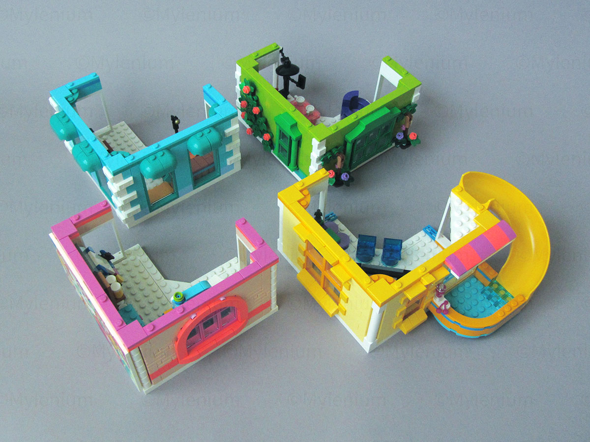
The different levels each have their own theme and as already mentioned multiple times, the first one represents a karaoke club or another type of musical venue like a practicing studio if you want to interpret it this way. Except for the stage and piano it looks a bit barren and one would wish they’d at least stuffed it to the brim with musical instruments. I wouldn’t expect them to “burn” the exclusivity of the contra bass/ cello from the Jazz Club (10312) just yet, but even without that there are so many to chose from, given the number of new molds they’ve done in recent years. even just throwing in a leftover keytar from VIDIYO would have worked wonders.
, Level a")
, Level a")
The second floor has a social media and streaming studio with all the trimmings like an editing/ recording computer, a small make-up corner and a seating arrangement for the host and guests. The background is built from more purple-ish tiles with some Magenta thrown in. in light of no carpets that’s at least something.
, Level b")
, Level b")
The third level is a gaming with a huge screen in the corner and the game controllers making an appearance. The green thing in the right corner is some unspecified tabletop game. At least I couldn’t quite make sense of what it is supposed to represent. This floor also has a balcony with a slide leading down to it from the floor above as a little fun item.
, Level c")
, Level c")
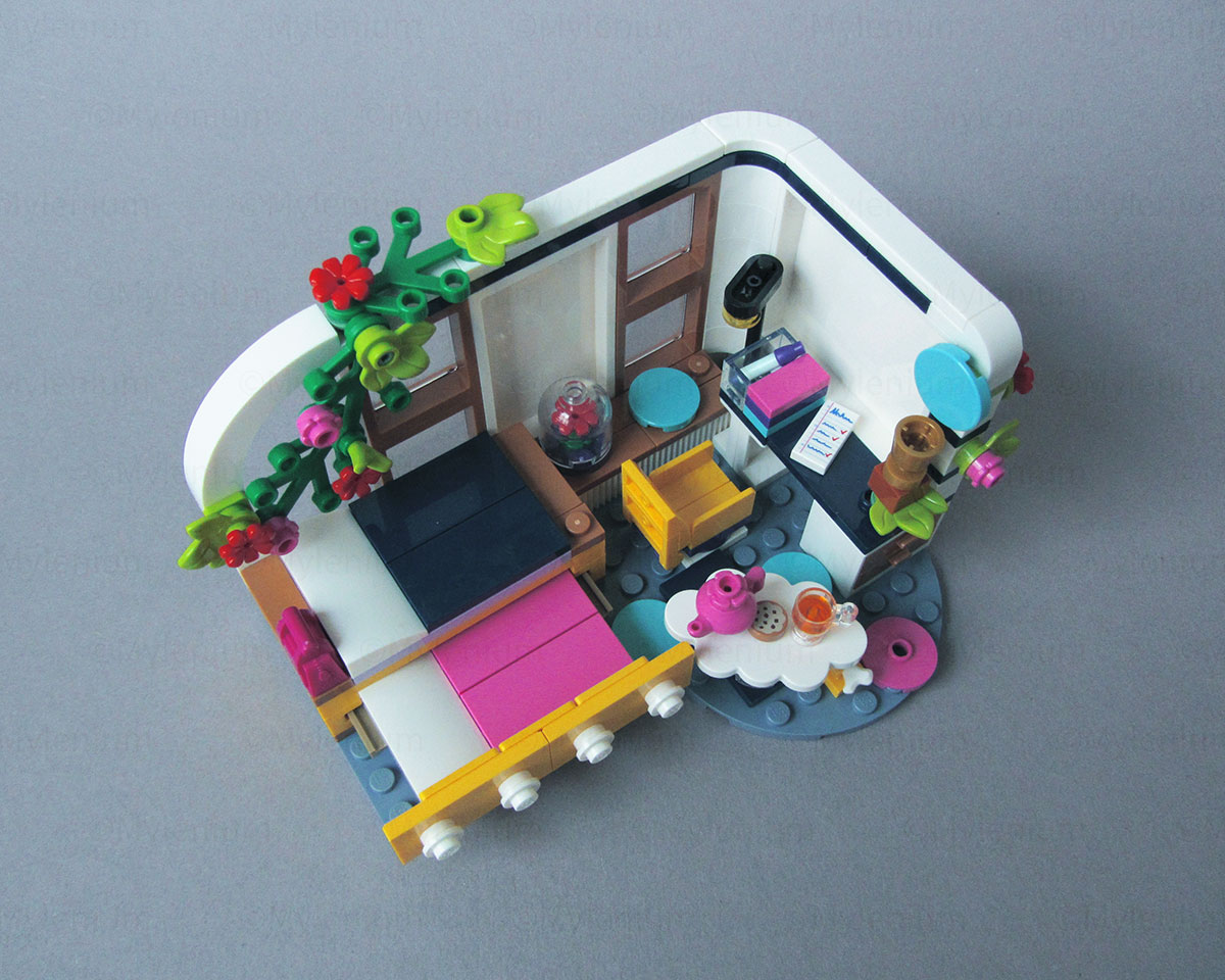
The topmost floor houses a small tailor/ needlework workshop alongside a more generic painting studio. This very apparently is also meant to directly relate to the large poster hanging outside and is obscuring the two large windows in terms of how it may have been made. An interesting detail here is that this is the first model to give us the 1 x 2 masonry brick in Light Nougat, i.e. in skin color.
, Level d")
, Level d")
The rooftop is home to a small greenhouse garden and has some of the usual utilities and appliances you would expect such as the water tank. The fixed window cleaning crane and platform on the other hand feels rather overblown and unrealistic.
, Roof")
, Roof")
The reason they put it there is of course once again the graffiti poster on the outside even though it’s still not very plausible. It’s like they couldn’t make up their mind on whether it was painted inside the atelier or directly sprayed on a blank canvas on the outside. In any case, the poster itself is a fully printed 16 x 8 tile, which in itself is worth mentioning. In another universe LEGO would have just dumped another large sticker for this in the package, so it’s a definite improvement and makes it so much easier .

The Community Kitchen
Initially I wasn’t too keen on getting the Heartlake Community Kitchen (41747). it had a few interesting aspects, but not enough to warrant the high price. That changed when I kept studying the digital building instructions (as I always do before making a purchase decision) and of course the set being advertised as an extension to the community center therein. The more I kept thinking about it, the more it swayed my opinion and then of course my completionist urges kicked in as well. So eventually I couldn’t help but commit to it, after all.
, Front Right View")
, Front Left View")
, Back Right View")
, Back Left View")
One of the reasons I wasn’t too convinced at first is that the set poorly disguises its nature as an add on for another set and thus feels incomplete. The serving area on the top feels like the rest of the building was forcibly capped off and they only needed to have something there to not make their intentions too obvious. Based on that of course the model follows the structure of the community center to a T and it even uses the same L-shaped brick plate on top, just in Medium Lavender this time.
, Right View")
, Left View")
The corner door adds interest, but I also found this to be the most problematic area. For some reason that I couldn’t quite figure out there is too much tension in this area and as a result you get notable gaps. This does not only extend to the 4 x 4 tile on top, but also affects the side walls. I rebuilt this part of the model at least three times, looking for what i may have done wrong, but no matter how carefully I put everything in place the issue persisted. It’s minimized once the weight of the roof presses everything down, but it never goes away completely.
, Roof")
, Roof")
The roof itself feels a bit cheap. The trees feel like those fake plastic plants and don’t do anything to make the whole thing more cozy and atmospheric. This is clearly a case where a second tree similar to the one on the big building would have worked ten times better. It could have had a nice large overhanging canopy and even could have been a bit gnarly.
, Interior")
, Interior")
, Stairs")
The interior of the kitchen is adequate, but as mentioned in the figures section would be seriously lacking personnel to actually do the work. You’d need at least three people here to make the scenario believable.
The Full Tower
Finally getting to the big reveal, let’s see how the combined result of the two packages turns out. How this works is not hard to guess during the build already, as you already see where those Technic bricks with the pin holes are just like the build pattern of the kitchen’s upper edge will look all too familiar if you built the community center beforehand.

The foundation of the latter is converted to the new base for the dining area. However, this comes at the cost of mostly breaking any logic in terms of how this section would be accessed by customers. You’d have to implement quite a few changes to make this plausible. When doing so one would likely also cover up the gap and in doing so also expand the seating space. This would be particularly relevant if you put it up permanently in your LEGO city.
, Extended Build")
, Converted Build")
Combining the two models turns an already large building into an even bigger one and it becomes somewhat unwieldy and difficult to handle even for an adult. If it wasn’t for the possibility to separate the various sections it would be difficult to transport. I had to learn that the hard way when I was trying to juggle it as a whole and the top level smashed to bits on my kitchen floor and I had to rebuild it.
, Full Building")
, Full Building")
Concluding Thoughts
Overall this certainly is a nice combo. The buildings look and feel “real” and wouldn’t look too shabby even next to some Modular Building, give or take the necessary modifications to fill in some open spaces, create logical accessibility and tone down a few all too crazy colors. At the same time there can be no denying that this is quite an investment and this may disqualify it from being an option for some. After all, the actual price difference compared to a genuine Modular Building isn’t that big and those Euros add up. For that same reason I feel that this would also be hard to justify as a play set for your children. Even for a special occasion like Christmas this could probably only be rationalized if you have two kids or more playing with it. Certainly LEGO have moved past that level where these things could be picked up as a spontaneous purchase on the spot.
With all that in mind it’s hard to give a definitive recommendation in either direction. I sure liked and enjoyed my time with these two sets, but it’s easy to see that some people may be deterred from committing to them. It’s still Friends and while the sets have become more “realistic” and grounded in recent years, it’s still not for everyone. In addition implementing a few changes could incur further extra cost if you don’t have the parts in your stock, which is also something to consider. The same goes of course if you were to buy two or three sets to create an even bigger tower or expand the footprint. Point in case: There are some good ideas here, but they come at a price.


 The animals are exclusive to this set, which could be another major reason to get this package. In particular the red-furred baby kitten is cute, but there are just as many reasons to love the Golden Retriever, mundane as it may be. It’s in fact quite odd that this dog isn’t used more widely throughout other sets.
, Center Section, Front View")
, Center Section, Back View")
, Center Section, Stairs")
, Center Section, Right View")


, Furniture Store, Entrance")
, Furniture Store, Tree")


 Since the store is more or less just a storage facility with the actual furniture items to be used elsewhere, it feels a bit chaotic and quite unrealistic. Beds hanging off walls may not be impossible, but it’s certainly not very common, either.
, Furniture Store, Back, Middle Floor")
, Furniture Store, Lamps")
, Furniture Store, Glass Chairs")


, Flower Store, Left View")
, Flower Store, Back View")
, Flower Store, Right View")
, Flower Store, Entrance")
, Flower Store, Front, Top Floor")
, Flower Store, Back, Top Floor")
, Flower Store, Back, Bottom Floor")
, Flower Store, Roof, Front View")
, Flower Store, Roof, Back View")


, Car, Front Left View")
, Car, Aft Left View")
, Car, Right View")
, Trailer, Front Right View")
, Trailer, Front Left View")
, Trailer, Aft Right View")
, Trailer, Aft Left View")
, Trailer, Right View, Door")
, Trailer, Left View, Table")
, Trailer, Roof, Aft View")
, Trailer, Roof, Front View")
, Trailer, Front View")
, Trailer, Tow Bar Clip")

 The only thing I would change is adding a few more details. Clearly there is some unused space behind the mailbox, even if it’s just for a small dresser. This wouldn’t conflict with the ladder even if it may look this way on first glance. Similarly, you’d likely have some extra stowage under the roof like nets being attached to the walls to stuff in clothes or some shelves with hinges. It’s a minor point, though, and there are no extra pieces to fill those areas, anyway.


 The minidolls feature Kayla, Leo and Autumn and extend that 1970s vibe with their clothing, some of which conspicuously looks like those neon-colored neoprene suits or gym wear of that era (technically it’s probably more the early 1980s). There’s not more to say than that. The figures are serviceable, but nothing really stands out.
 A big attraction of every new cycle are new animal molds and for this year we’re getting otters at last after their siblings in the City series debuted earlier this year. Regrettably, those two sets of animals exist in parallel and stylistically are quite different, so no matter how you see it, it’s not the best use of LEGO‘s development resources.
 The only side build in this set is the jet ski, apparently used to get on and off the research platform and retrieve animals and test materials from the sea. It’s the most basic build you can imagine, consisting only of an inverted wedge piece as the base whose studs have been covered up with the bare minimum of other pieces. Again serviceable, but nothing to write home about.
, Right View")
, Front Right View")
, Front Left View")
, Back Right View")
, Back Left View")
, Detail Stairs")
, Detail Columns")
, Detail Treasure Chest")
, Lab separated")
, Lab")
, Lab Appliances")
 On top of the tower there’s a small watch post/ surveillance lookout that can be swiveled around. It serves the play fantasy in that someone would be on post observing the surroundings and triggering an alert if an animal in need is detected. It’s a bit barebones, though, and also irritates me a bit since the designers opted for the most flimsy version of the turntable, so it feels wobbly and turns a bit too easily for my taste.

 The figures for Zac and Dia again have this 1970s/ 1980s retro vibe for some of their clothing, but in the grander scheme of things it’s consistent with the other set.
, Beluga")
, Beluga")
, Front Right View")
, Front View")
, Front Left View")
, Aft Left View")
, Aft Right View")

 This set is the first regular set to make use of the

, Box")
, Box")
, Box")
, Overview")
, Overview")
, Overview")


 Apparently the girls like to have their film night once in a while and thus we get a small separate projector assembly. It has a small twist in that they are watching stuff from their phone, which is slotted in as a printed Orange tile on top. Naturally, without having applied the sticker this little extra looks a bit bland, but somehow LEGO seem completely unwilling to give us a t least a bunch of standard elements with contemporary prints. It’s really kind of weird that they hang on to printed tiles they introduced over a decade ago, but can’t be bothered to bring out some flashy new stuff to go with the times.


 The little obese kitty gets its own toy station, but not really much else. It could have benefited from having a tray or cat castle as an extra. On the bright side we do get a little goal for the two boys to play soccer/ footy, including an Orange ball. this could have come in a different color like Dark Azure with white decorations perhaps to make it more distinct. The model already has an awful lot of Orange and Coral parts.
, Front Right View")
, Front Right View")


 Playing video games all day is of course not always a fulfilling activity and for health reasons you have to have some other interests as well, so we get a little workbench that hints at the two possibly being involved in skating or other activities. It’s never really spelled out what it is, but at least those tools would come in handy to fix the cart of the paraplegic dog.

 The seating is modeled after those gaming chairs, but in the end feels more like a captain’s chair ripped of a Star Trek ship bridge. It’s just a bit too bulky due to the limitations of building it with existing pieces. A side effect also is that it actually cannot be turned around without scratching the “table”. if you look closely you also see that this causes some sort of “hole” in the scene, i.e. an area where no real detail is placed. Adding some flowers on the right hand side of the table could have avoided that.
, Shelf closed")
, Shelf open")
